Switching identities to deliver greater client confidence.

How we helped Kiwi Express promote a dedicated courier service that takes on the client’s branding.


Taking “client facing” literally.

The unique dedicated service offered by Kiwi Express gives clients the exclusive use of a driver and a van for as long as they want. Both driver and vehicle can even take on the client’s identity.

Words designed to move people.

Kiwi Express is more than a courier company. They become part of a client’s business.

This idea of integration is reflected in the way the headlines interact with imagery when users scroll up and down the page.


Life stories that drive the message home.

Case studies demonstrate how Kiwi Expresses dedicated offering delivers the goods across a diverse range of scenarios. And oh yes, a handy interactive tool on the website’s home page lets users change the van and driver livery to the client brands discussed in the stories.
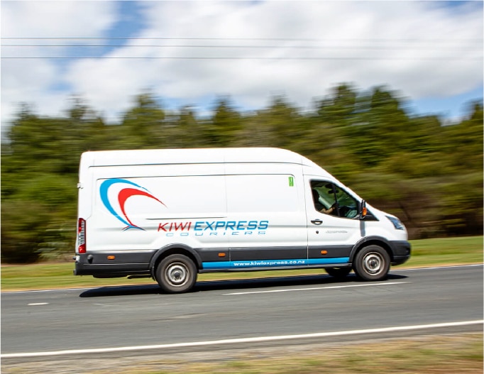
 

The right direction for photos.

A picture, they say, is worth a thousand words. We made sure the photography said all the right ones by being involved at every stage of the creative process – from concept to post-production.


Making people feel better about surgery.

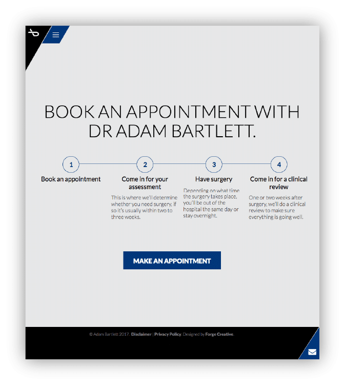
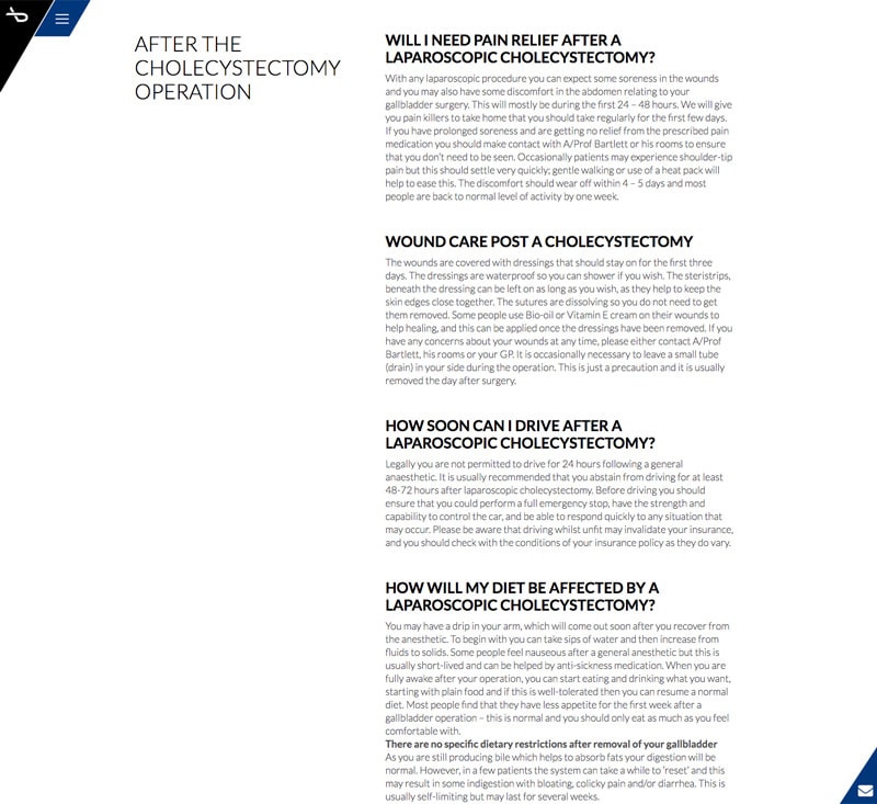
How we helped improve the health of HPB Surgery’s website.


Giving a logo a new lease of life.

We took Dr Bartlett’s existing logo and created a precise, professional look that also picks up on the stylised representation of a scalpel for added visual appeal.

Establishing an air of authority.

A brand is about more than a logo. Careful consideration around colour, fonts and tone of voice helps to build a sense of trust, credibility and knowledge.

Primary colours


A perfect balance to boost traffic.

The site combines SEO common-sense with eye-catching aesthetics. The result? Measured over a 3 month period the increase in impressions for Adams most sought after keyword group was 1449%. That’s 14x more impressions. With accurate well written page titles, and custom meta descriptions improving the click through rate by 100%, the resulting increase in clicks was a whopping 2,888% nearly 29x more organic traffic. All without any dodgy link building and in full compliance with googles webmaster guidelines.

See More
 

Signposting surgery with simple icons.

A custom-designed icon was created for each and every condition to help guide patients through their journey to booking a consultation.


Portraying professionalism through photography.

Being hands-on throughout the photographic process meant we could ensure that all key points were visually expressed correctly. It didn’t stop with the final click of the camera. Post-production reinforced the sense of professionalism with its use of the brand blue and monotone backgrounds.

The end result looks great, and most importantly appears to be reaching out to the right audience.

“The team at Forge designed and built a new website for my business that far exceeded my expectations. They were easy to deal with and made the process effortless. The end result looks great, and most importantly appears to be reaching out to the right audience. I wouldn’t think twice about engaging their services again in the future."

Dr Adam Bartlett

HPB Surgeon and Associate Professor


Creating a sense of awe for concrete space.

How we help PeterFell colour their customer’s thinking.


A website to wow.

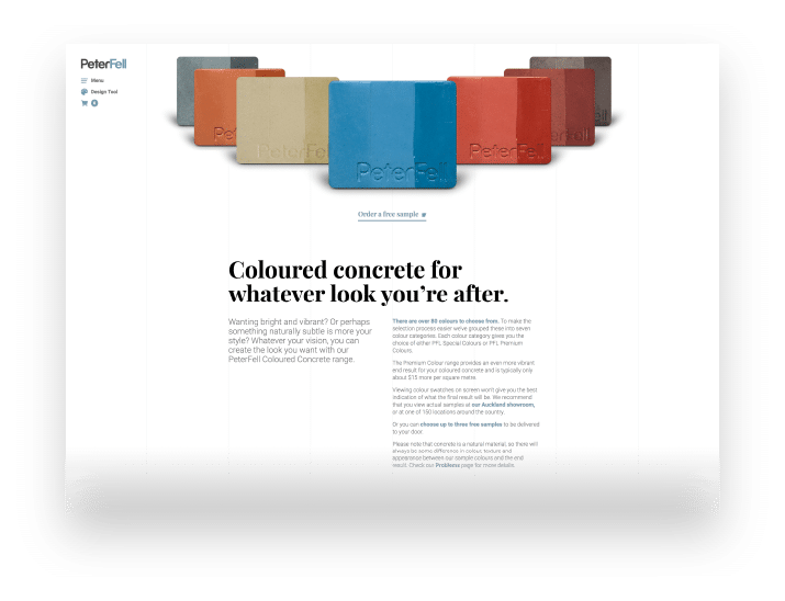
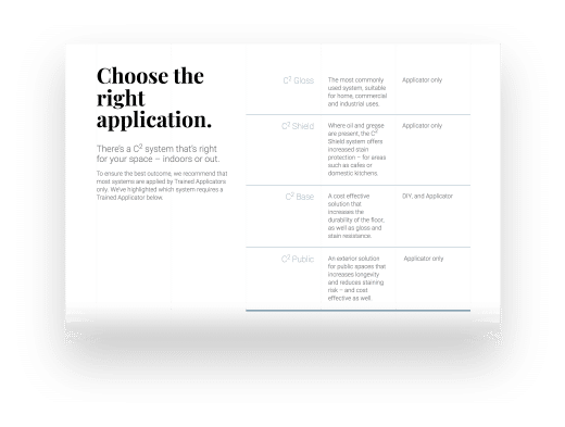
PeterFell produces the oxides that transform run-of-the-mill grey concrete into something far more inspiring. It was our job to create that same level of inspiration on the website. In the case of the homepage, we let the gallery of awe-inspiring photos tell the story, drawing the user in to find out more.

Built so they will come.

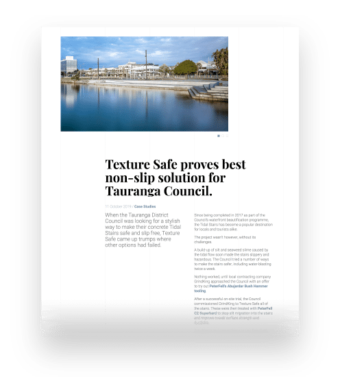
We put some solid thinking around what should be said, so the site ranks well on search engines. We keep our thinking fluid, with ongoing recommendations and enhancements that keeps the site performing.

Step by step to a happy space.

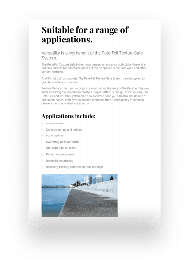
A design tool takes users through the five key steps to creating the space they want using coloured concrete. At the end of the process, they will get free coloured concrete samples.

Communication is timely, research is extensive.

"Our experience with Forge Creative has been excellent. Communication is timely, research is extensive, and we love what the team at Forge Creative have created for us."

Emma Stewart

Marketing Manager, PeterFell

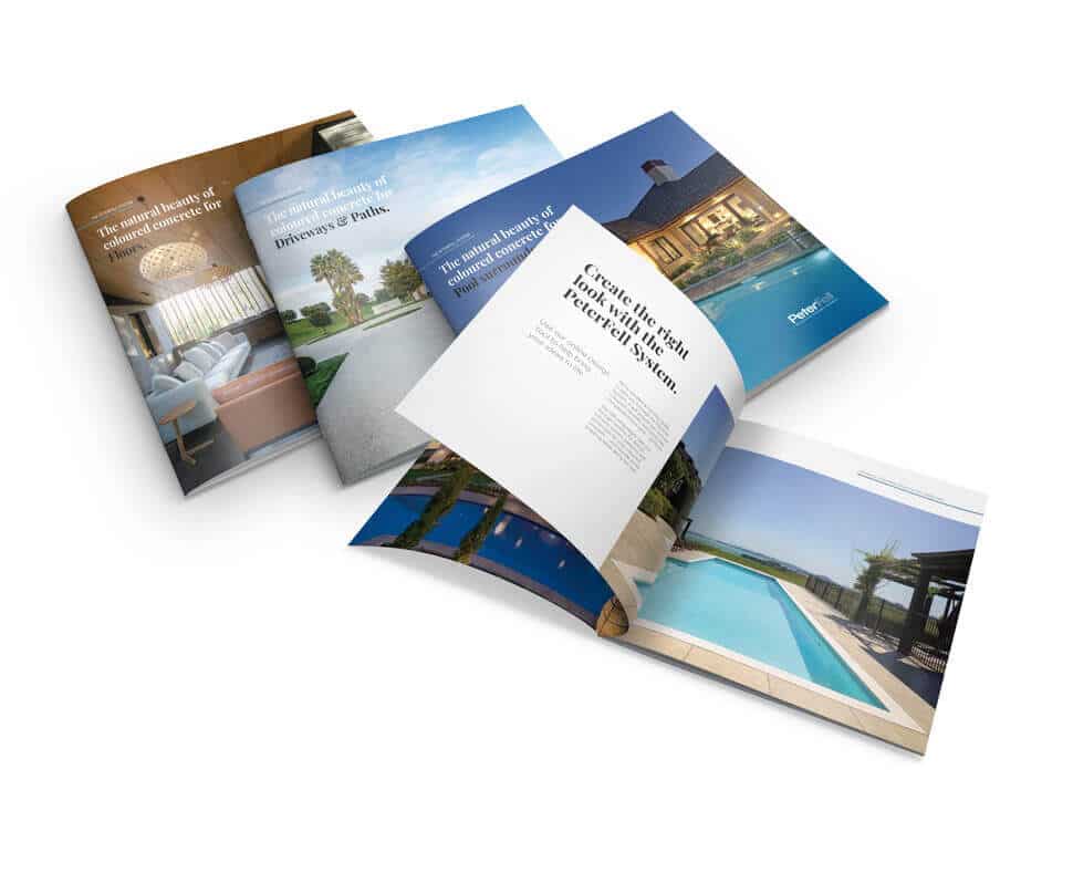
Persuading in print.

The look and feel of the site is reflected in a suite of brochures. The sense of space that has been achieved on the website is here accomplished using a square format that also helps to lift the brochures out of the ordinary.

Creating a fresh addiction for bread lovers.

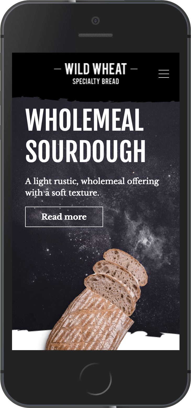
How we whet appetites with Wild Wheat’s new website.


Sharing the love.

Andrew Fearnside from Wild Wheat loves to bake. We share that same passion when it comes to design. You could say, then, that all the ingredients were in place to create something wonderful.

Designed by hand (well, mostly).

We decided to convey Wild Wheat’s artisan approach to baking with some tastefully hand-crafted graphics of our own. Blending rustic textures, chalk marks and handwritten typefaces help to create a sense of natural goodness.

Images to drool over.

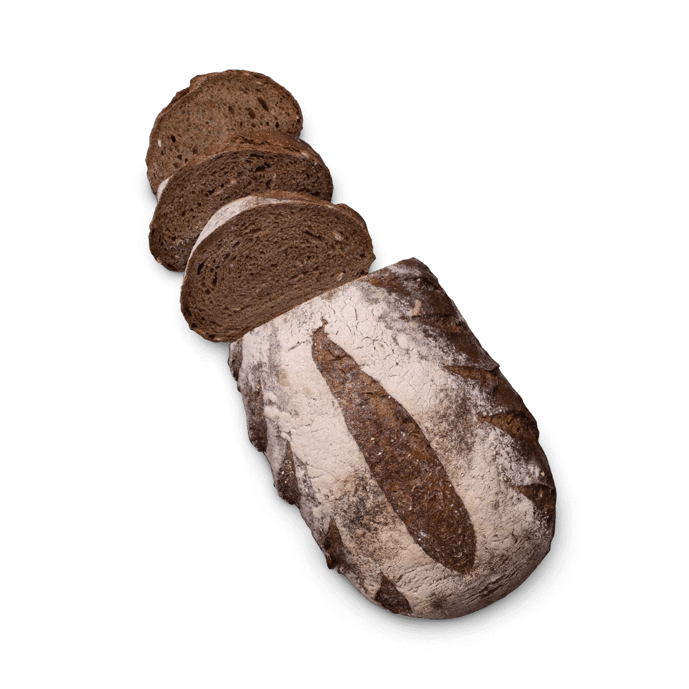
When it comes to food, a picture, they say, is worth a thousand tastebuds. We worked closely with the photographer to infuse the imagery with a freshly baked aroma that seems to rise from the screen.

Always doing things the best way, not the quickest or the cheapest.

“Reading the brief, the one thing that came through loud and clear was Andrew's passion for baking the finest bread possible. Selecting only the finest ingredients, the level of care and patience at every stage of the process, always doing things the best way, not the quickest or the cheapest – all of this is really evident in the finished product. I believe this same level of passion and attention to detail are what go in to creating great design."

Bond Te

Design Director, Forge Creative

Tasteful to all views.

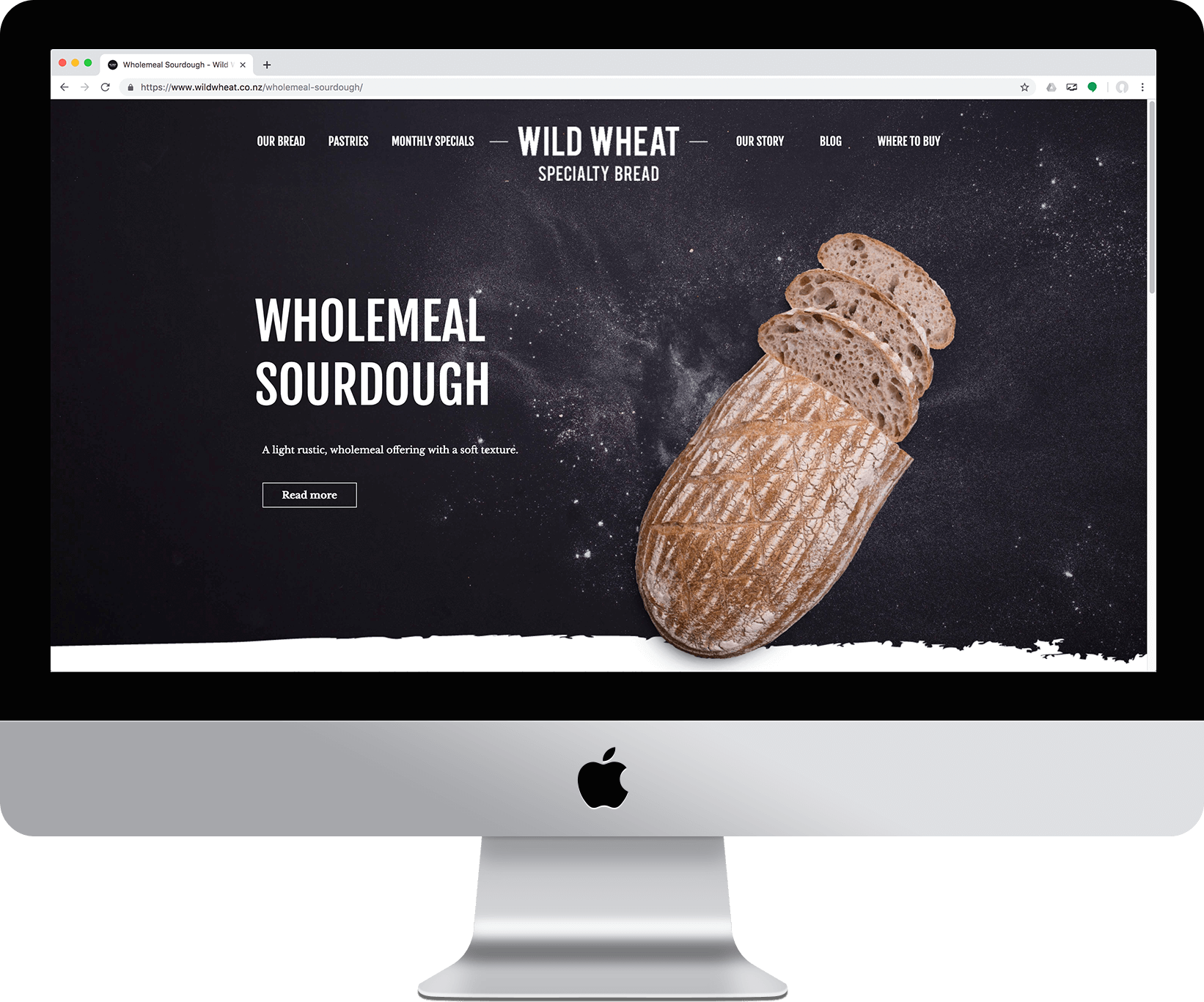
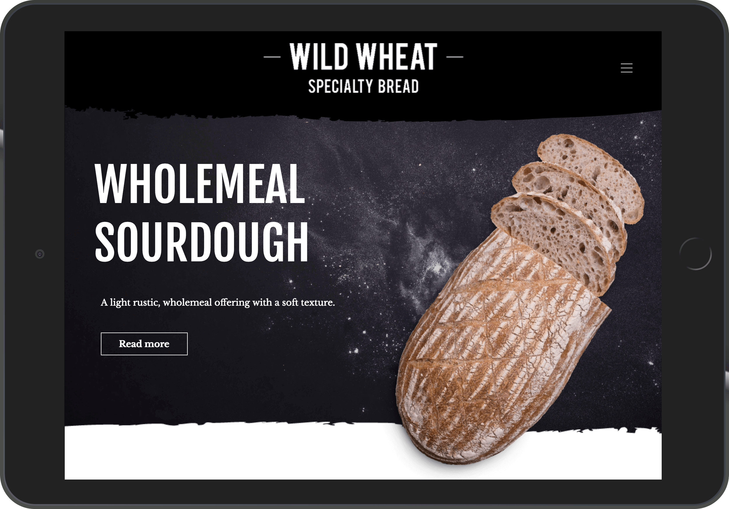
Like all good websites, Wild Wheat carries its good taste across any device it’s viewed on.

Creating a slice of heaven.

How we launched a new brand that’s all about classic Kiwi.


Two words that say all the right things.

HS Trading is a New Zealand-based importer of quality foods. They briefed us in to create an umbrella brand for a range of wholesome products they were bringing into the country. It needed to conjure up a sense of naturally grown goodness amid lush green fields and bright sunny skies (the sort of idealised world we remember as kids).

Oh yes, and there had to be a strong Kiwi feel about it too.

After much bouncing around of ideas we came up with Riverside Farm, supported by a simple graphic element that conjures up all the rustic serenity the name implies.

Creativity cooked to perfection.

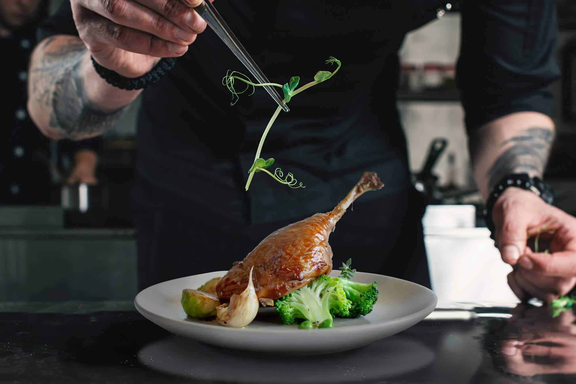
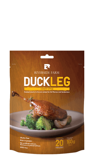
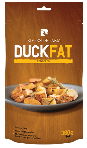
We wanted the food to be the star – a deliciously balanced blend of inspiration and aspiration. What better way to achieve this than by asking a top Auckland chef to create a range of dishes using the duck and then art directing a skilled food photographer to capture the end results.


Getting food to fly off the shelves.

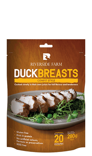
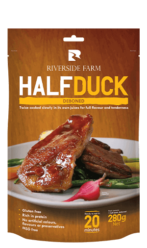
The first range on the Riverside Farm menu was pre-cooked Duck – a first for New Zealand that has since secured shelf space in Countdown stores nationwide.

An elegantly simple dish overlaid on a rustic wooden background shows how consumers can use pre-cooked duck to create restaurant-style dishes quickly and easily in their own homes. At the same time, the imagery and choice of typeface helps to reinforce the brand’s values of down-home honesty and goodness.

Countdown have taken the full range.

“We are so pleased with the packaging, the product is selling really well and Countdown have taken the full range.”

Amanda Zhou

Director, Riverside Farm

Feeding a passion for cooking.

Kiwis love to cook. The Riverside Farm website is brimming with useful tips for making something wonderful happen in the kitchen (as well as stirring assorted culinary emotions, as all good food sites should). These same tasty words of wisdom are available as recipe cards in-store.


Putting a fresh perspective on engineering.

How we helped Mulcahy promote the partnership angle to their clients and prospects.


The argument’s black and white.

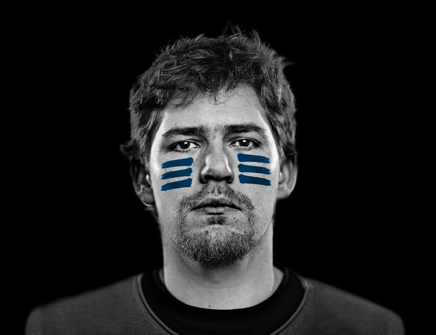
How do you create more impact with your collateral? Take away the colour.

Okay, we did make judicious use of Mulcahy’s brand blue as well, but you see what we mean.


Imagery that strikes the perfect balance

Mulcahy is all about enabling innovation. They achieve this by collaborating closely with their clients, and then putting their in-house technology and skills to work to provide the right solution. The imagery we’ve created demonstrates this productively positive partnership between people and capabilities.

How to show a thought.

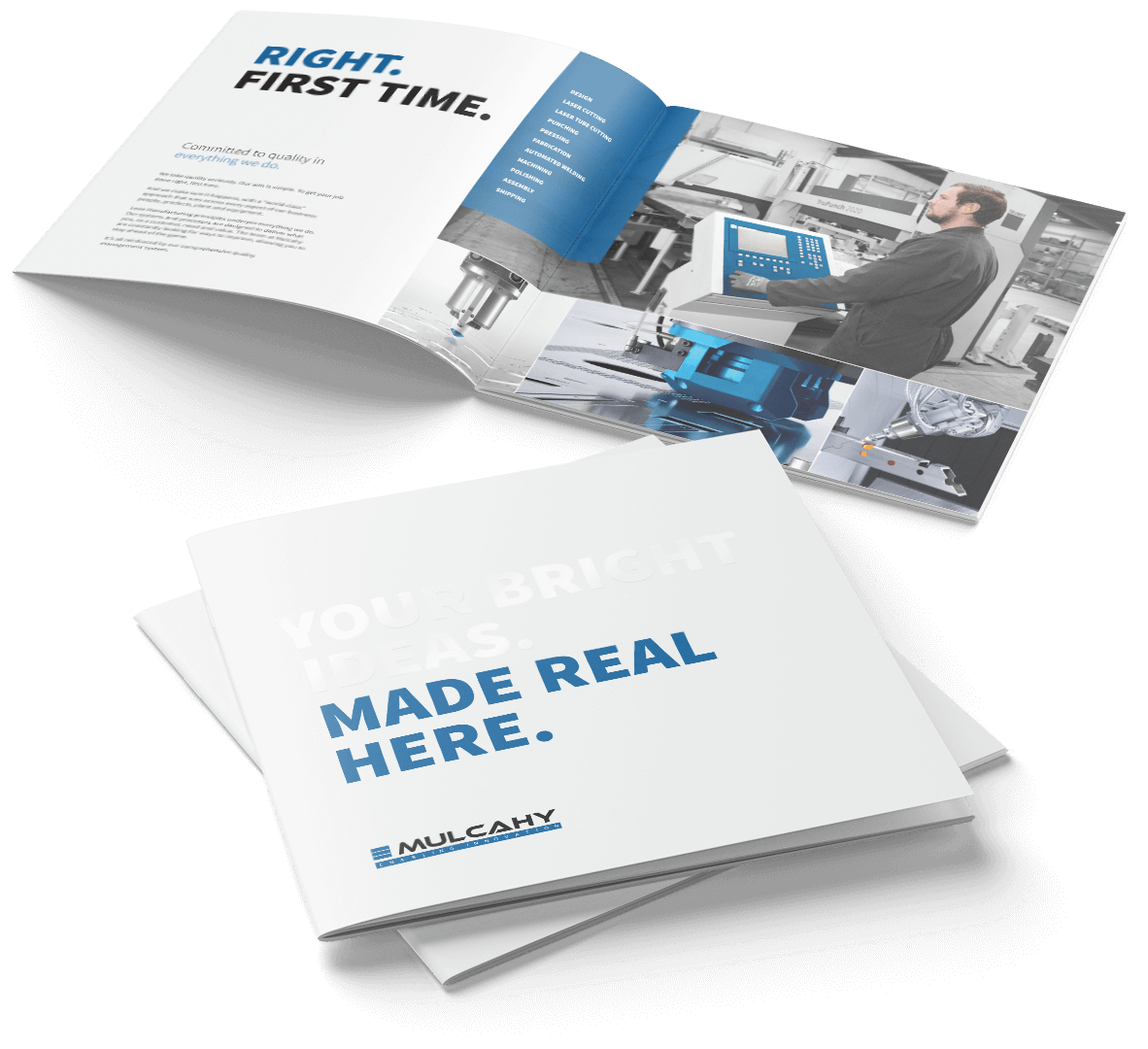
An idea is just that. An idea. Mulcahy can make it real, as the use of spot UV on the cover of their profile clearly demonstrates.

Mulcahy Company Portfolio Design

Videos to help move the audience.

We created a series of videos that displayed each and every one of Mulcahy’s capabilities – from intensive close-ups of laser cutters to swooping drone shots of buildings and trucks.

Giving house hunters a healthier alternative.

How we helped Waikare Estate sell the good life.


The best of both worlds.

Waikare Estate is a housing development nestled in the township of Te Kauwhata, halfway between Auckland and Hamilton.

Handily placed, it offers homeowners the best of both worlds – relaxed (and affordable) rural living that just happens to be close to the major job centres.

The essence in a logo.

Selling the dream started with a logo design that captures the essence of the brand. A gently undulating landscape bathed in sunlight conveys the laid-back lifestyle, while the font hints at simple, less stressful times.


The site that dreams are made of.

The promise of a more relaxed environment in which families can grow is reflected in the tone of the website, with its warm palettes, lifestyle images and copy.

The site doesn’t ignore life’s practicalities. It’s built in WordPress, making it easy for the client to update and maintain. That’s a must when properties are listed and sold on a regular basis.

They clearly understood what we wanted to convey.

“The Forge team worked closely with us to create a brand that effectively reflects the lifestyle benefits that Waikare Estate has to offer. They clearly understood what we wanted to convey and expressed this across all of our marketing collateral.”

Ryan Castles

Sales Manager, Waikare Estate


Creating tactile support.

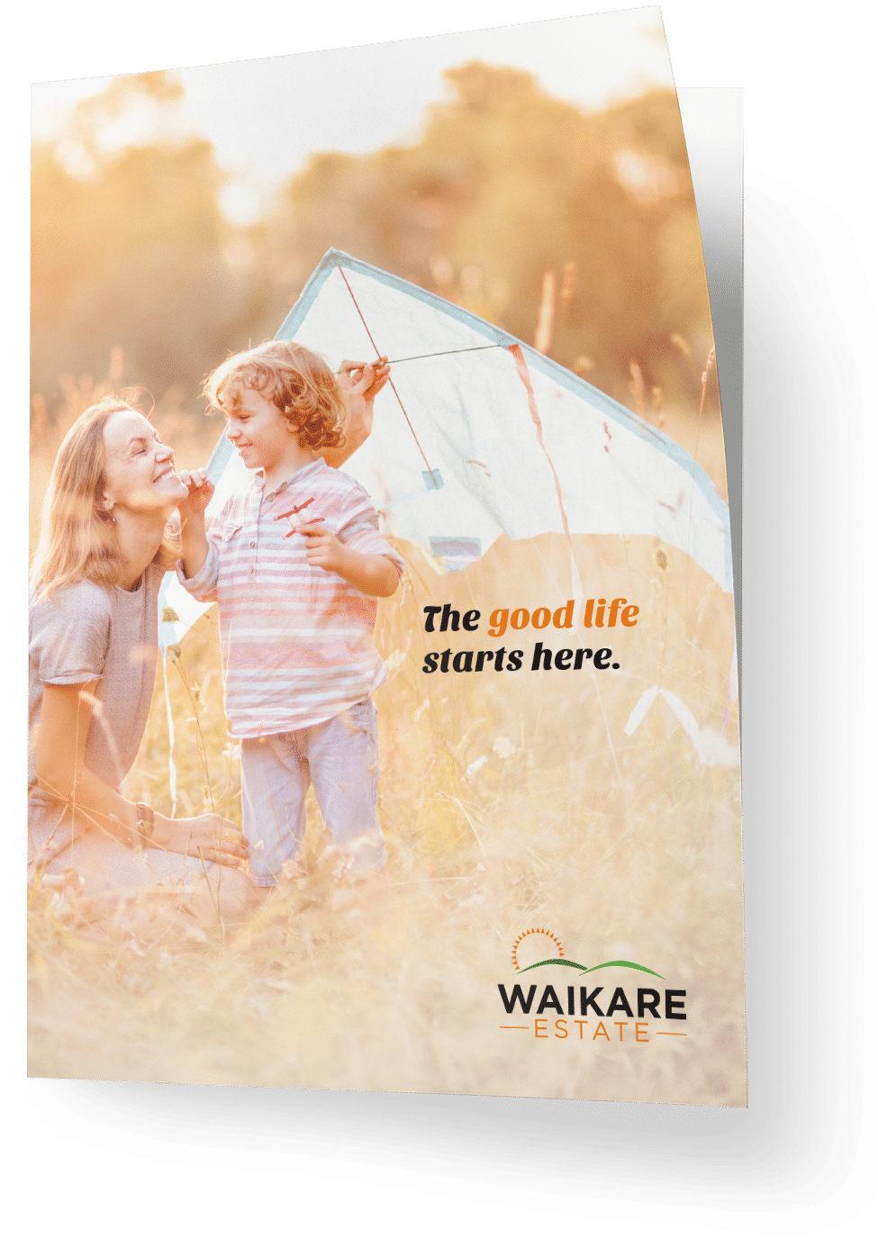
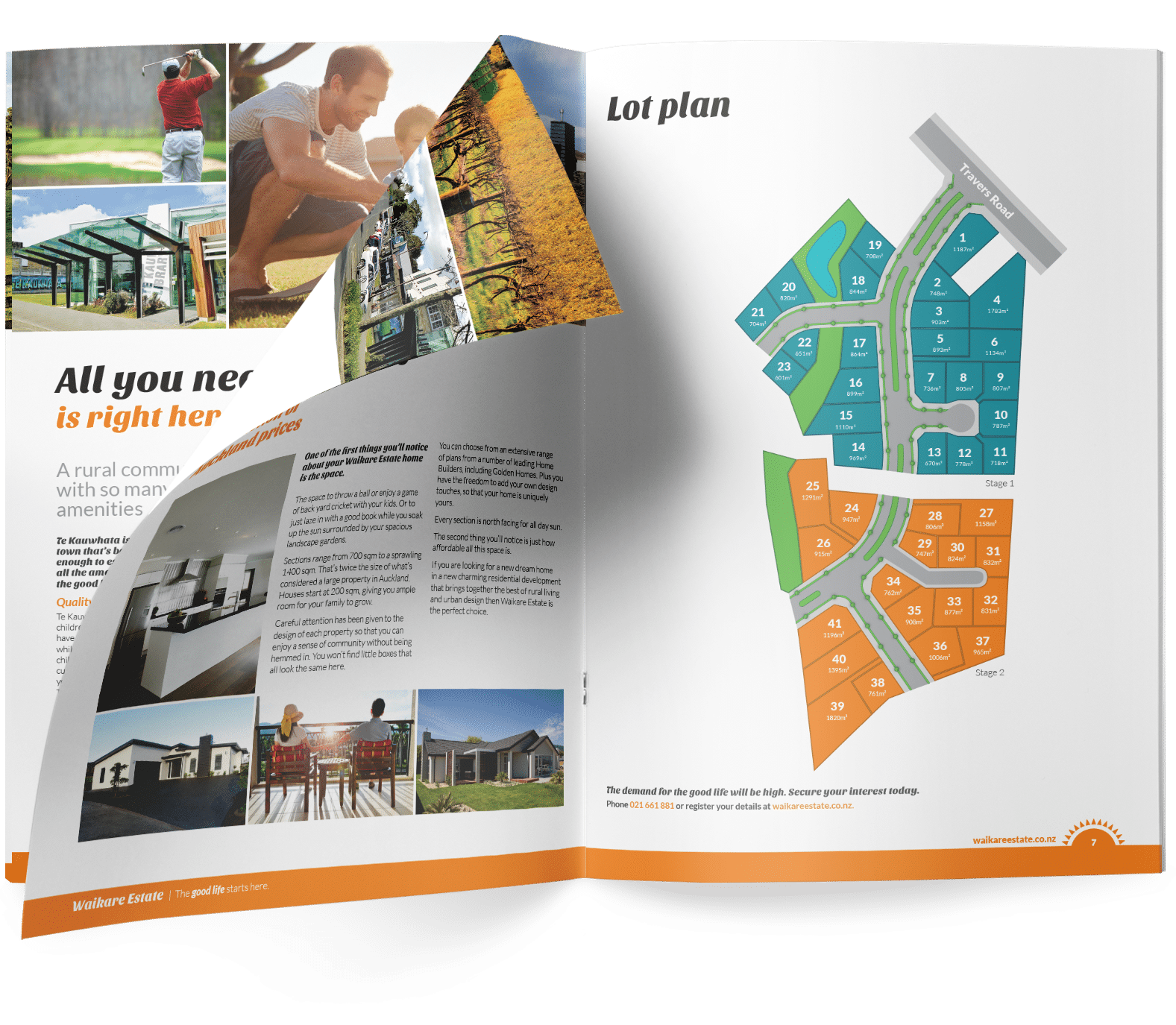
We carried the promise of better living across to a brochure and billboard.

Creating tactile support.

We carried the promise of better living across to a brochure and billboard.

Time to sell a dream?